Thursday, December 31, 2009

Nightmare Pro Wrestling Pages 24 and 15 Pencils


Well it looks like my update schedule is still suffering from the Holidays. Hopefully everything will be back to normal soon.

Here are pages 24 and 24 of the NPW webcomic. I'm excited to finally be getting to the action portion of the comic.

The pencils are done a little tighter this time around because I've changed my method of inking, which you can check out on the last two updates on my website. This new inking method is quicker and I think more suitable for the feel of the comic. I'll explain further about the new inking process when I upload the Inked pages on Friday.

I'm pretty happy with the panel layout as well as the action going on. I'm not to sure about Devastator Dragon though. I originally wanted a upshot of him but I feel like I've had a lot of those in previous pages. I think he needs to look more menacing so I might redo the image.

Well come back on Friday to check out the Inks and be on the look out for great things from Nightmare Pro Wrestling in 2010!

Later!

Friday, December 11, 2009

NPW Page 20 and 21 Inks


Here are the Nightmare Pro Wrestling inked pages 20 and 21.

If Nightmare Castle's Dining Hall looks a bit different that when you first saw it, it's because it is. The old version of the Dining Hall was taking way too long to do. So I came up with a simplified, cleaner version of it.

I'm not sure if the backgrounds will take away from the characters interaction with each other in page 21. I'll test it out and see what it looks like.

Quick note, I made all the outlines of the foreground characters thicker and the characters that are more in the background have thinner outlines. This is just something subtle that helps establish depth. Just a little advice for you aspiring comic book artists out there.

Alright, have a great weekend.

Later.

Thursday, December 10, 2009

NPW Comic Page Pencils-pages 20 & 21


I'm finally getting back to my blog. It's been a while but now I'm back, a lot of stuff has been going on but let's not get into that. Here are the pencils for pages 20 & 21 of Nightmare Pro Wrestling. These two pages came out really well. I'm especially happy with the acting of the characters.

After drawing these pages I have discovered that I really like drawing the Beast. He was originally going to be a minor character but now, I feel that he deserves a slightly bigger role.

These to pages are also the last pages before we get to the pro wrestling portion of the comic. Now that's really exciting.

Make sure to check out the Inks of these two pages on Friday, here on my blog, and the complete pages on Monday, at the website.

Cheers!


Wednesday, December 2, 2009

Technical Difficulties

It seems like it's just been one thing after another lately. First we were sick, then it was Thanksgiving (not that our Thanksgiving was bad, but delicious foods and spending a wonderful long weekend with family is not conducive to frequent blog posts and producing comic pages). And last week the wifi signal we've been using was suddenly locked. Boo.

But we'll be getting our own internet this week and then we can be back to our regular scheduled programming: 2 new comic pages on NightmareProWrestling.com on Mondays, upcoming Comic Page Pencils on Wednesday, upcoming Comic Page Inks on Friday, and warm-up sketches in between.

-N


Friday, November 20, 2009

Inks for Page 15 &16


I'm still feeling under the weather but I definitely feel better than yesterday. I hope I can shake being sick soon, especially before Thanksgiving. So today's post is going to be a little brief. I'm doing this via my iPhone since my laptop can't connect to the internet right now.

Inks for pages 15 & 16: I've again lowered the opacity on the background lines so as not to interfere with the line of the characters. The backgrounds on page 16, are my lines combined with real textures put through various filters. They look a little messy right now but I hope they will work better with color added to them.

Alright Later.

Wednesday, November 18, 2009

Page 15 and 16 Pencils


These pages came out quicker than usual. I'm not complaining, I'm glad. All of the background image ideas flowed really well onto the page too.

The doors in the hallway and to Grave's room, are the only thing I really can't figure out at the moment. At first I wanted one door, but now I'm thinking of having two giant doors for each room in the housing area of the castle. I'm thinking all the doors will be different but full of detail. However, lets see if time allows me to put as much detail as I want.

I didn't touch up my lines for the post like I said I wouldn't. You can see the blue lines from my blue line pencil. I use a prisma color non photo blue pencil. It helps me to be quicker and much looser with my drawings. Once I have what I want with the blue lines, I touch it up with my technical pencil and flesh out the image more. I don't know what I would do with out my non photo blue pencils.

We are now getting to last few pages of this issue. I'm pretty excited because the next pages are gonna be real fun. Not only that but we'll get to see some actual wrestling in the story! So keep coming back and checking for updates, here on my blog and at the Nightmare Pro Wrestling website.

Tuesday, November 17, 2009

Dark Beard's Curvy Tattoo


So I feel a little disappointed that I couldn't meet my deadline of posting my new pages on Monday. I ended up falling behind, as real life started to catch up to me. I didn't want to just whip the pages together in a hurry and post them. I wanted to give the pages the proper attention and make sure I was happy with the final result.

Even though this caused me to post up the pages pretty late on Monday, I am happy I took my time to finish them up. However, I will do my best to not let that happen again.

Alright, well here's the warm up sketch for today. This is a quick sketch of one of Dark Beard's tattoos. This one is going to have a fun story behind it. I have a single issue planned to flesh out Dark Beard and will include a story of how he got this tattoo so you'll have to stay tuned to see how that turns out.


Friday, November 13, 2009

PAGE 13 and 14 INKS


I can't believe it's Friday again. Where did the week go? I'm also not looking forward to the end of the month....it's my birthday, I'm getting to old. Oh and by the way HAPPY FRIDAY THE 13TH!!!

Well here are the inks for page 13 & 14. I'm really happy with the amount of detail I was able to put in the panels this time around. These are the first pages that I've noticed a vast improvement in my style. I really like it. I personally think these two pages show that I finally have down the look I want for the comic. As an artist you should always try to improve. I'm not saying I'm great but I'm getting better, LOL.

These are also the first pages that I have lowered the opacity on the background lines. I feel this will allow the readers eyes not to be to overwhelmed with all the detail and will draw their attention to the lines that are important to the story. This is going to be my first time trying out this idea, hope it works.

Alright, well check out the Nightmare Pro Wrestling website on MONDAY for the finished pages.

Later.

Wednesday, November 11, 2009

PAGE 13 AND 14 PENCILS


It feels like I haven't posted any pages on my blog for a while. Today feels a little off, maybe it's because I didn't get a chance to workout this morning. Not that it's been a bad day, I've gotten a lot of stuff done, it just feels strange.

Alright back to the Pencils for pages 13 & 14. I again placed the word balloons where I would like them. This has been helping a lot when lettering the pages, as well as drawing the backgrounds. If there is something important in the background, I can now just draw it in the panel where the planned word balloon won't affect it.

For example on page 13, I want a shelf with creepy stuff behind Dr. Nightmare. The shelf will also have Britney's Teddy bear, which Dr. Nightmare will hand to her on the next page.

Speaking of Britney, this will be her introduction into the comic. She seems sweeter on these pages which will contrast to when she shows Grave her real personality.

So it probably shouldn't bother me but adjusting the color to my pencils makes them look pretty bad, at least in my eyes. I should just start uploading them like I do my warm up sketches, so you can see the blue lines and pencils better. That'll look more visual appealing when I post up pencils in the future. Bleh, it's not a big deal but I'll try and do it.

Tuesday, November 10, 2009

Cycloptopus


I've been getting a lot of work done lately. I've notice that I seem to be at top form in the morning and then slow down as the day goes on, I'd like to see how much I could get done if I was working at top speed all day.

For my warm up sketch today I drew Cycloptopus who will be one of the NPW wrestlers. I haven't quite decided how big of a role he'll have in the comic. I made myself draw this guy as fast as possible and as usual to all my warm up sketches, I couldn't erase anything. This helps just get the basic info I need to draw the character with as few lines as possible. This is an old art school trick I learned while I was going to a university in Texas. I'm not going to say which one because this is one of few things I actually learned there that had some use.


Later.

Friday, November 6, 2009

Inks for Pages 11 & 12


I fell a little behind this week since I got sick but I did finish the inks for pages 11 & 12.

PAGE 11: I think I got how quick Grave is grab, thrown, and strapped, pretty well. I'm really happy with the details in the background. If you look closely at panel 7, you can see little creatures in the jars. I'm sure you'll see them a lot better in the final pages. I'm really looking forward to coloring this page. And looking at the page now I'm thinking about adding a stone floor.

PAGE 12: I purposely didn't put a lot of detail in this page for a few reasons. For one I feel like it it slows the page down and this way your eyes aren't going crazy focusing on everything. Two, There will be a lot of word balloons in the last panel, so why put stuff in the background if it's gonna be covered up. Finally, I hate to admit it but the last reason is because needed to save some time so that I can make sure these pages are finished by Monday.

But don't worry, it's not the end of my detailed backgrounds. If I do have some extra time I'll throw something in.


Alright

Wednesday, November 4, 2009

Pencils PAGES 11 & 12


Not feeling to well, so just gonna get right down to it.

Page 11: This is the introduction of Dr. Nightmare. I wanted to make him creepy and very animated. Animated as in he moves around a lot. The backgrounds for both pages are going to have weird machines and shelves full of weird stuff.

Page 12: This page is the introduction to Grave's dad, Skull. I wanted the first image of him to be powerful, so I posed him in a strong confident pose. This is also the first panel I worked in the word balloons to see where they would look good. Not set on every balloons placement.
The final panel still needs a little work I think. For one, Skull, I feel, is to short. I am also not sure whether I want a table full of weird stuff in the foreground. I'll test it out and see how it looks.

Alright, Sorry for the late post.

Later.


Tuesday, November 3, 2009

Victor Monstor & Lil Franken Entrance Sketch


We had a great Halloween! We went down to visit my family to celebrate with the annual Guerra Halloween party. My family, as usual went all out with the decor, creating a lot of original stuff themselves. The whole house looked amazing. Not only that, it was my wonderful wife's first experience at a Guerra Halloween. She loved it.

Alright now on to the warm up sketch. I really like drawing these two. The two best friends come out to the ring together like this with Victor Monstor carrying Lil Franken on his shoulder. I would elaborate on the whole entrance, but I really want it to be a surprise when it happens in the web comic.

Friday, October 30, 2009

Page 9 & 10 inks


Page 9 & 10 Inks

Well it's Friday. Wow time has been going by pretty quickly. This weekend will be awesome though, gonna go spend time with my family for HALLOWEEN. Should be great!

Page 9: I didn't put the flames behind Grim on the 2nd to last panel yet because I don't want them outlined in black. I think if they are, then they would take away from the panel. I'm really happy with the over all flow of the page.

Page 10: I really love the way this page came out. If you look closely you can see little details, like spider webs. The light source for most of this page will be coming from the candelabra in the background. Again I'm hoping to establish a fun but spooky mood, that will help establish the overall mood of the NPW universe. Hopefully I'll pull it off.

Check out the finished pages on the NIGHTMARE PRO WRESTLING web comic on Monday.

Hope you have a spooktacular HALLOWEEN!!!
BWAAAAHAAAAAAAA.....

Later.

Thursday, October 29, 2009

Britney Nighmare Warm Up Sketch


You'll be meeting Britney Nightmare in the next couple of pages of our Nightmare Pro Wrestling webcomic but I thought I'd give you a quick intro with my warm up sketch today.

Britney is a bratty character but she can't be all bad when she obviously has such a soft spot for a teddy bear, right? Right? I guess you'll just have to wait and see :D

Oh, and in the comic she will have legs, she isn't really a ghost bride of Frankenstein, it just looks a bit that way.

Wednesday, October 28, 2009

NPW Web comic Page 9 & 10 Pencils


Well it's almost Halloween. I'm really looking forward to this weekend. Halloween has always been a big thing in my family, so my wife and I are driving down for the weekend to spend Halloween with my family. I'm excited!

So these are the Page 9 & 10 Pencils.
Page 9: The last panel on this page was orignally going to show Grim punching Grave through a wall but the image didn't look too exciting. So I went with Grim's fist punching through the panel. I really want to put a lot of detail on the fist when I start to paint it, just to add a creepiness to it, as well as focus. I had drawn this page out a while ago but when I looked at it again, things didn't look right. So I redrew some the key panels and just touched up the others. Nothing much more to really say about this page.

Page 10: I'm really excited to be working on page 10. I'm hoping to establish the mood of this universe even further with the page. I plan on adding more detail to the suits of armor, and maybe change them a bit. Looking at them now the small suits look a little too much like Alfonse from Full Metal Alchemist. I do plan on adding a few other things like spider webs and more detailed stone walls in the background.

Alright, thats enough for today.

Later.


Tuesday, October 27, 2009

Victor Monstor and Lil' Franken


Here is my morning warm up sketch for today. There's poor Victor Monstor who has fallen off a tiny bike. He got a few scrapes and his best buddy Lil Franken brings him a double scoop ice cream cone to make him feel better.

Hahaha. You can see my lovely wife's sketches visible from the page behind it. Especially Cycloptopus.

This is another sketch I would like to use for something else, a print perhaps? I would really like to finish up this drawing, add in a side walk, and creepy little neighborhood in the background.

Monday, October 26, 2009

Nightmare Castle Background Sketches & Nicole makes an appearance

So this is my first post on our blog! Since Jon's an amazing artist I usually leave the drawing to him and focus on writing for the comic and tweaking the website but every so often I do sketches to help brainstorm ideas.

This is a collection of some small sketches I did about things that could be in the background when characters are in the hallways of Nightmare Castle.

As Jon has mentioned before, he likes to do really detailed backgrounds as a way to make the Nightmare Castle feel like a real place where things are going on beyond the panels of the comic.

Mixing and matching different historic periods seems to help create the spooky aesthetic we're going for so I thought it would be fun to have a medieval suit of armor mixed with some Victorian style portraits and a tufted sofa.

Or a monster clinging to the wall with some books on his back next to some bird cages and a sleeping plant that will probably be hungry when it wakes up.

(Cycloptopus is just a side sketch of an idea that Jon had for an octopus wrestler -- it made me think of an octopus wearing a wrestling sling with a little tentacle mustache under his beak)

I don't know how many of these ideas will make it into the comic but I always think it's cool to see Jon transform my sketches into something that fits into the NPW Universe.

And actually if you like drawing you can even send Jon a monster you created and he'll put them in the crowd at an NPW wrestling match. The first match is coming up at the end of this first issue so you still have time to send one in :D

Also, the new pages for this week are up so check them out on the website at www.NightmareProWrestling.com!

Love and whatnot ----> Nicole

Friday, October 23, 2009

Pages 7 and 8 Inks


Here are the inks for pages 7 & 8.

Page 7: Putting together the arena in google sketchup was a pain to do, even if it was just basic elements. I just put together a basic Pro wrestling arena and just drew in the details.

Page 8: This page changed a bit since the pencils. I didn't really like the way the page was flowing so I decided to get rid of a panel and rearrange the rest a bit. I wanted the ring in the training room to look different than the ring in the actual arena. So I didn't add a lot of blacks and changed some shapes. The colors will also be different. I wanted the dumbbell that Grim is using, to be massive. I also wanted it to look a lot more realistic and match the background elements.

I really like the way panel 1 turned out. I wanted to put all this detail in there, along with a few monsters working out. I had wanted to show more of the training room but it would have taken away the focus of the panel. The whole point of that panel is to show you where Grave, Lobo, & Grim are. This will make things easier for the reader and the actions on the page will flow a whole lot better.

Alrighty, well back to work. Check the Nightmare Pro Wrestling web comic on MONDAY for the final pages.

Cheers!

Thursday, October 22, 2009

Nightmare Pro Wrestling Announce Team


I got more sleep last night so I'm feeling a lot better today. I'm really hoping I can finish up a page I'm working on. Anywho, here's this mornings warm up sketch.

The NPW announcers are Milky Roach, a ex wrestler turned announcer, and Corpus Callosum, a giant brain creature in a robot body.

Milky Roach will be the Heel(bad guy) commentator which basically just means he'll always be defending the bad guys illegal actions in the ring.

Corpus Callosum is, of course, the Face(good guy) commentator and always on the the good guys side but respectful of the bad guys talent in the ring, until the bad guy does something illegal.

Writing interesting and funny banter between the two is gonna be a fun challenge. They'll also be really useful characters since they'll be able to comment on what's happening in the wrestling ring and explain the rules of wrestling matches. Nicole keeps joking around that we should make a glossary of wrestling terms since not everyone is a big wrestling fan and knows the ins and outs of all the terminology.

Roach and Corpus will be making their first appearance in the later part of the first issue of my NPW webcomic -- so stay tuned!

Alright,

Later.

Wednesday, October 21, 2009

NPW Webcomic Page 7 and 8 Pencils


Blah! I stayed up late watching the Office then got up early as usual but I was too tired to workout. Still feeling a little rundown. No more sleeping late for me.

Here are the pencils for pages 7 and 8.

Page 7: I'm finding that drawing all the key images first, scanning them, creating the page, then quickly sketching out the other elements in Photoshop, is really working for me. It allows me to see how the page will look put together. It also lets me do quick adjustments to the page with little trouble. Panel 4 is my favorite panel of the page. I'm really happy with the way the deranged look on Lobo came out.

Page 8: The panel layout was a little more complicated on this page, so I just quickly did it in squares and lowered the opacity. Again I drew out all the key images in my sketch book, scanned them in to my computer, and quickly sketched out the other elements in Photoshop. My favorite panel of the comic so far is on this page and it also happens to be panel 4. I'm really happy with the body language that came across in this panel. I feel I got Grave's energy and enthusiasm down, as well as Lobo's frightened hesitation.

All right thats enough for now. Come back during the week for more warm up sketches and INKS of these two pages on FRIDAY.

Later.

Tuesday, October 20, 2009

Fiend's Backbone Finshing Move -- Warm Up Sketch


So, I had a great surprise this morning. I downloaded the podcasts I listen to every Tuesday and started my warm up sketch. As I'm listening to one of my favorite podcasts, Art & Story Alive, host Jerzy Drozd brings up the question I had sent as a discussion topic. Not only that, he also mentioned my web comic :D

That was pretty awesome.

My question to them was about lettering speech patterns & accents and whether it's better for the artist to do it or to let the readers create them in their heads as they read.
Jerzy, Co-host Krishna Sadasivam, Ryan Dow, and Javier Hernandez, had a really great discussion and brought up some very interesting opinions and advice. I really appreciate it, thanks guys. You should check out their stuff -- it's really great ( you can just click on their names)

Art & Story Alive is one of the podcasts that has helped me keep my mind creative while I was working a non-creative job. They helped me with artistic inspiration and motivation, when I was considering throwing in the towel.

I've mentioned these podcasts before, but if you haven't checked 'em out yet, here are the links: Art & Story, ChrisOatley.com, Big Illustration Party Time. Check them out, I promise you will be happy you did.

Today's warm up sketch is of Grim doing his finishing move the "FIEND'S BACKBONE"
which was originally called the Devil's Backbone.

Why change the word Devil to Fiend? Well, I didn't want to freak out kids and parents. Well more so not to freak out the parents. The reason I chose the word "Fiend" is pretty simple. The Japanese card game/anime Yugioh changed the names of their demon cards into fiend cards, here in the U.S. to be more kid friendly. That's the first thing that popped into my head when I was thinking of changing the name. It works : )

I was also asked recently by a friend of mine why all the characters finishing moves were real moves and not crazy Anime moves? Good question.

Well first of all, I didn't want to be compared to the Anime Kinnikuman (or Ultimate Muscle, here in the U.S.) I really like that anime but that's not the direction I wanted to go. All of my monsters do have superhuman strength but I wanted to focus on just how brutal and awesome real wrestling moves would be with that kind of strength.

Second....hmmm, I guess there is no second. The main point is that I just wanted to do something different. There will be crazier moves that we will see in the comic but I have a STRONG rule of not doing any crazy Kinnikuman/DBZ moves. That and changing moves that involve a crotch in the face -- awkward to draw, awkward to read.

Later!

Friday, October 16, 2009

QUICK INKS!!


I've gotta get a lot of stuff done before this weekend, well come to think of it I need to finish a lot of stuff before this evening. I'm gonna be going to Houston this weekend to attend the wedding of two of my best friends.

So lets get to it!
Page 5: I found some cool reference pics for the backgrounds. Again I collaged some images and combined them with my pencils to get the right effect. I added some things too. I added Grave & Lobo to panel 5, seemed like it was needed. I feel the kitchen in the last panel needs a little work, which I will get to in the final version.

Page 6: I love the details on this page. That was the main thing I wanted in each panel, detail. Especially in the graveyard in panel 2. I ended up adding even more in the final version. Check out the Finals on Monday.


ALL RIGHT, I GOTS TO GO!

Cheers!

Thursday, October 15, 2009

AAAARRRGH!!!


So I've decided to just post up the warm up sketches on days that I don't post up Comic pages. It'll save me some time.

I really want to see Where the Wild Things Are and hope it lives up to my expectations. I think the creatures or "Wild Things" look so cool, especially when I see them running in the trailer. That is totally what a chubby creature would look like if it took off running, LOL. I read they were created with practical meshed with digital effects, which I think is the best way to go in any movie. I really hope I'm not disappointed.

Any who, lets talk warm up sketch. I asked my wonderful wife this morning for an idea for a warm up sketch, she said that Dark Beard the undead pirate is one of her favorite characters in the comic.

This image quickly pop into my head as soon as she suggested the character.

Enjoy,

Later!


Wednesday, October 14, 2009

Pencils Time!


It's Wednesday, time for the pencils of the next two pages of the comic.

Lets start off with Page 5. As usual, after thumb nailing the page I drew each of the characters separately and scanned them in. I created the panels I needed and quickly sketched out ideas for the backgrounds that I had in mind. I added two additional figures during this process, the Lunch Hag, seen on the last panel, and the janitor in panel 2. I ended up drawing them in my sketch book along with weird foods to put in the buffet in the last panel.

Remember nothing is set in stone. If you feel like your image needs something more just throw it in there. Also remember, keep things simple but interesting. It's easier to add something than it is to take it away. I definitely have learned that the hard way and it can be a pain.

I searched the internet for similar reference images I could use for the backgrounds I sketched out. Lately I've been looking for reference images that I can just collage together to get a better visual of what I want. I just touch it up the way I want it and make my own adjustments in Photoshop until I get what I'm looking for.

Page 6: I know the backgrounds look more finished than the rest of the page. That's because I forgot to save the sketch work and only realized this while I was doing panel 3. Oopsy.

The background lines are a collage of my own pencils and modified photo images I put together. I then put them through the cutout and poster edge filter in Photoshop. This has been saving me a lot of time with doing the backgrounds. It also gives me the look and feel I want.

Alright, til next time,

Cheers.

Tuesday, October 13, 2009

Bouncy bouncy, having such a good time!


I've been testing out the finishing move designs during my warm up sketch time. Here's Devastator Dragon doing his Devastator Stomp. I'm still not sure about it. I want to see what a double foot stomp would look like, think I will do a few sketches of it that way, just to see how it looks. Either way it'll be fun to draw, picking great and different shots of this finisher and other moves is something I'm really looking forward to drawing.

Thinking about how to draw in-the-action wrestling moves is actually something I've been paying attention to while watching WWE wrestling. I was talking to Nicole about how I've been noticing how they frame shots and how certain shots would be more interesting drawn as a comic.

One of the cool thing about comics is there's no limit to camera angles.


Cheers!

Monday, October 12, 2009

Mr. Hyde Loves Candy, Not Babies -- Morning Sketch


One of my favorite things about doing morning sketches is getting a chance to get a feel for how I want to draw each of the characters. I've done character sheets for everyone but it's different drawing a character in a static pose than doing a dynamic sketch.

Today I did this quick sketch of Mr. Hyde. He has what me and Nicole have dubbed "bad guy nipples" which I've drawn on all the mean/bully characters in the comic mostly because I think they look funny and I think they somehow add an element of ugly meanness.

You won't meet Mr. Hyde until the 2nd issue of the Nightmare Pro Wrestling webcomic but you can read a little more about him (and see a picture of him in color) on his NPW Roster page.

Later,

JoN

Friday, October 9, 2009

Inks for Pages 3 & 4.


Well it's Friday. Again? Wow, now that I'm doing the pages for my comic and morning sketches on a regular schedule, time has just been flying by. One of my best friends gets married next week up in Houston, I'm looking forward to having a blast up there. Then my wife and I have to prepare for HALLOWEEN. Halloween is my favorite holiday and it's a big thing with my family. We're going to take a six hour (blah) drive just to celebrate it with them, should be great. What are we going to dress as? You're gonna have to wait and see.

Alright to the pages.

I've tightened everything up in Illustrator and used a lot of stock and props I created specifically for the comic.

One of the reasons I wanted the backgrounds to look more realistic than the actual characters is that I wanted there to be the feeling of the possibility of other things going on within the backgrounds. I wanted to promote that there were other things going on in the castle besides the characters we see in the panels. In the final version of the pages I will add small details like glowing red eyes, bats, or monsters in the background doing stuff. That's also why I added the security guard in the background.

The security guard looks a little off perspective. I wanted him to be huge, so in the final colored version, which you can see on Monday at my website(Nightmareprowrestling.com), I made him huge. I didn't want him to be too important in the panels but just wanted him there for mood and thought the idea of a giant monster security guard would be fun.

These pages were done during my whole feeling out phase. The lizard falling joke, again which you can see in its entirety in the finished pages, is something I thought would be funny. Hopefully it works.

The background in panel 3 I designed early on and kept in my stock/prop images for the castle.

I think the the only thing I would have changed is the direction Grave and Igor are walking in panel three. If I were to flip the image, Igor would be on the wrong side of Grave and I design the panels for Igor to be on the left side of Grave. That's where my philosophy of letting a page go even if you're not 100% happy with it. You have to know when to let go, learn from it, and do better on the next page.

Besides all that I'm really happy with the way these pages turned out.

Alright, HAVE A GREAT WEEKEND!

Later!


Thursday, October 8, 2009

He's mad I tells ya!! MAD!!!

Time for this morning warm up sketch.
I wanted to draw Dr. Nightmare looking creepy. I'm still experimenting with his expressions and body language. Most of the time you wont be able to see Dr. Nightmare's mouth but when he smiles, I wanted a long toothy grin. I'm still perfecting it, I think it should come up on his face more, but we'll see.

I would have liked to have taken more time on the beakers and jars. I would have added more detail and put some more creatures in jars, but it's supposed to be a quick sketch, I try not to stop and I don't erase unless its absolutely necessary.

I think the key to developing a character further is to find their personalities through facial expressions and body language. Doing so makes the character more alive. IT'S ALIVE!!! IT'S ALIVE!!!

Remember to checkout next weeks inked pages tomorrow.

Alright, LATER!


Wednesday, October 7, 2009

PENCILS! Pages 3 & 4


Alright well here are the pencils for the new pages, pages 3 and 4.


As you can tell I still wasn't sure how to set up the page yet. I was still trying to figure out the quickest way to do the panels on the computer.

I should mention I do thumbnails first (maybe I should post those too), then sketch out each panel separately in my sketch book. I scan the pencils into my Mac, then according to my thumbnails, I set the page up. I add all the details by sketching them out in Photoshop using photo references. I make little notes where I want some sound effects and write out other notes that will help me remember certain things I want in the pages.

Notice in Page 4 that I'm using a close up of the NPW Castle doors for the backgrounds in panel 1 and 2. Its a quick a time saver :)


Alright that's enough for now,
CHECK OUT THE INKS FOR THESE PAGES ON FRIDAY!

Later!


Cover, pages 1 & 2 INKS!!


Ok back with another quick blog during lunch, then back to work to finish up the new pages of NPW I'm working on.

Alright, well since this was the first official launch week, things are a little disorganized when it come to the blog pencil and ink posts. Originally, Wednesdays=pencils, Fridays=inks, and Mondays=FINISHED PAGES.

Today being Wednesday...right?(checks calendar) Yes. I'm going to post up the pencils for the new pages. However, I'm also going to post the Inks for the three pages that are already up. That's great news right? more content!

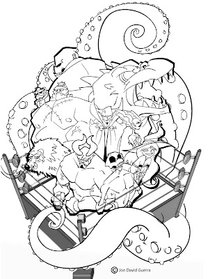
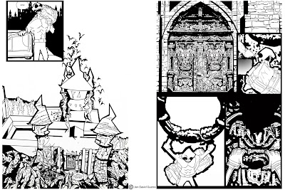
Here are the final inks for the cover and pages 1 and 2.

I ink in Illustrator cs4 by the way. I find quicker and it gives me the look I'm going for. I downloaded the ink brushes from a great artist called.... can't remember at the moment but ran across him on the web. I'll post a link in the future when I have more time.

Anyway back to the pages. Not much to say about the cover. I'm really happy with the way it turned out. I had the idea for this cover years ago when the ideas for Nightmare Pro Wrestling were just barely getting started. The earlier drawings, which I plan on posting in the future, SUCK!

This newest version is a lot better and like the story and characters, a lot more fleshed out than they were when I first started the idea.

The Inks of page 1 and 2 went through a few changes. For one, I made the lizard on the door in page 2 bigger.

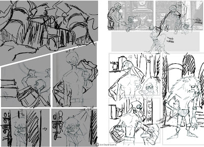
I also originally had 3 panels on page 1 but felt it slowed down the page too much. Wish I had the pencils to show you, so you can see what I mean.

The doors for the castle are a template I made so I could just cut and paste the image to save time. To get the look I wanted, I drew out the doors using a reference picture and made the changes I wanted to make it spookier and to avoid those pesky copyright issues :/
I ran it through the "cutout" and "posteredges" filters in Photoshop and merged them. Finished by multiplying the original pencils over it and cleaned it up till I was happy with it.

Alright that's it for these pages. You can check out the finished product on www.NightmareProWrestling.com

GRAVEYARD SHIFT!!!


Good Morning! I'm feeling very motivated and inspired today. I've gotten a lot done and it's only around 10:30a.m.

Well here we are again and it's time for today's morning warm up sketch : D

Here we have Grave hitting his finishing move on some unlucky opponent. I wanted his finishing move to be something quick and devastating, so I went with one of my favorite moves, the super kick. You might also know the move as "Sweet chin music" made famous by the legendary Shawn Michaels.

This is one of the quicker warm up sketches I did. Used a reference pic of Shawn Michaels because the kick isn't a straight side kick but more of high back kick. Or at least when performed by Michaels.

The reason I picked the Super Kick for Grave's finisher? It's quick, can come from outta no where, and it's going to be a blast to draw! I'm really going to love drawing the move in different perspectives and figuring out new and interesting ways to display it on the page.

Now it needed a name. Most pro wrestling finishers are named after the superstar that performs them, so I went with the GRAVEYARD SHIFT! Sounds cool enough, right?

I'm really happy with the way it turned out. Really happy with the look on Grave's face, It has a goofy seriousness to it, which can sum up most of his personality, hahaha.

Alright, well back to work, later!


Tuesday, October 6, 2009

Devastator Dragon - Morning Sketch

This morning I thought it would be fun to do more of a portrait style sketch of Devastator Dragon. In the comic he's pretty much always wearing his wrestling gear (aka little undies) and since he's such a big, bulky character I thought it would be interesting to see what he'd look like in a suit.

Monday, October 5, 2009

Luna -- Morning Sketch


Bleh! It's been a little frustrating setting up the website stuff and things associated with the website. I hope I get used to the routine quickly. It's already noon and I haven't even gotten to finishing up some pages yet.

Well Here's my morning warm up sketch for the day. What is a morning warm up sketch you ask? It's just a quick sketch I do every morning before I get to work on my comic. It loosens me up and gets me in the right frame of mind.

I sketch it as quickly as possible in non-photo blue pencil, then go over it in regular pencil, touching up all the details.

This sketch is of Luna and a fan eager to get her autograph. I really happy with the way the fan turned out. Nice and chubby and cute. Im happy with Luna, the only problem i have is with the way her hands, or rather, her hand came out.

Oh well its only a quick sketch, right?


Enjoy,

JoN

Thursday, October 1, 2009

Issue 1 Cover - Pencils

I just saw the trailer for the Nightmare on Elm St. remake. It looks good, if you can ignore that the first opening credit says "From Producer Michael Bay." I know Wes Craven wasn't involved in the remake at all, the studio or whoever didn't even try to contact him, but I'm going to check it out any way. I personally think the casting of Jackie Earle Haley was a great choice. Again I don't want to make any judgment calls yet. I gotta see it first to do so.

Anyway, here are the pencils for the cover of NPW Issue 1.

Here is a sketch for the cover of Issue 1. I started off with Grave and got his pose down during the sketch but the other characters need a little work. I'm happy with where the characters are in relation to each other but not how they are positioned. Midway through the sketch I felt like it needs something more. So I decide to add the Ring Squid (a creature you will learn more about in the comic.) to the background.
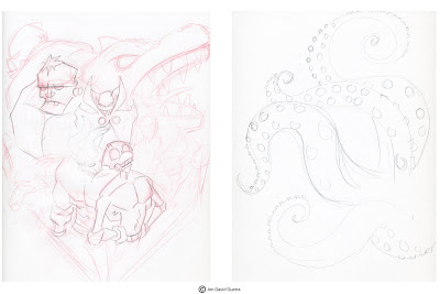
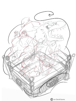
I always draw each character separately, so if I'm not happy with their placement I can move them around once I scan them into my Mac.

Once they're all scanned in, I use Photoshop to place them the way I want them. Using the brush tool, I sketched in the wrestling ring and where I wanted the Squid's tentacles to go.

You might have noticed that the design of the placement for Victor Monstor changed. Always remember that your design is not set in stone. If you want to change it, well, change it. I feel that the way he is positioned now feels more dramatic and adds to the flow of the design. I also added Lil' Fraken in there because the two are inseparable in the comic.

Soooo, I don't have the pencils for pages 1 & 2. I was still figuring out the process of creating the the pages, and forgot to save the pencils : /

I do have the inks and I will post those along with the inks for the cover, so don't judge that me to much. I was actually thinking of faking some pencil work but that would be too time consuming and just WRONG. I promise that the rest of the pages will have pencils to post : D

Alright well hope you enjoyed the blog,


LATER,

JoN

First Post, post haste!

Alright, well here's my first post. It feels crazy to finally be getting everything started. I want to just start off by thanking my wonderfully amazing wife, Nicole. Without her none of this would be possible. She's the greatest blessing in my life : ) Of course I also want to thank my great family and friends, there are too many to list but you know who you are.

I also want to call out a thank you to Chris Oatley, the guys from Art & Story, and the guys over at Big Illustration Party Time. They were a source of creative inspiration at a time when I was working at a job where the only real creative aspect was me imagining burning the place down. These guys made the work days bearable and kept my creative juice from going dry. Check 'em out, it'll be well worth it, especially if you're looking for art discussions and conversation, inspiration, and to learn some new things.

Alright, well here's what's gonna happen on this blog. My wife and I will discuss our opinions and views on things, as well as discuss whatever is on our minds. We will do our best to keep it in the artistic/creative area. Also I will be displaying the creative process of my web comic, Nightmare Pro Wrestling. I will be posting up inks and pencils of pages and writing a commentary on each of them.

My main goal is to inspire people. I know there are a lot of other blogs/podcasts wanting to do the same, the better ones being the three I mentioned in my first paragraph. However being a creative type myself, I know that the hunger and need for creative inspiration and knowledge is never ending. I hope to be at least one of those creative outlets. Especially for that creative person working that miserable part time job, where the only link to creativity is the elaborate scenario in your head of imagining that horrible place go up in flames.

Well here's the posting schedule for the Penciled and Inked pages. Additional posts will be sporadic but as often as possible and written by Nicole or myself.

1. I will be posting pencils for two pages on Wednesday.

2. I will post up the Inks of the same pages on Friday.

3. On Monday you can see the finished pages on the comic website at NightmareProWrestling.com


Alright, well here we go,

Later,

JoN