Thursday, March 24, 2011

Doomsday Rumble: Monster 2


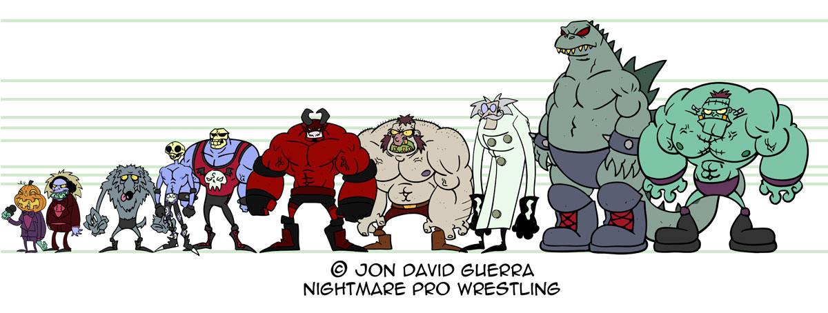
The 2nd Doomsday Rumble Monster is: PSYCHO CYCLOPS!

If you're familiar with Ray Harryhausen then this monster doesn't need much of an explanation. If you don't know who Harryhausen is, here's a site to check out: http://www.rayharryhausen.com/index.php.

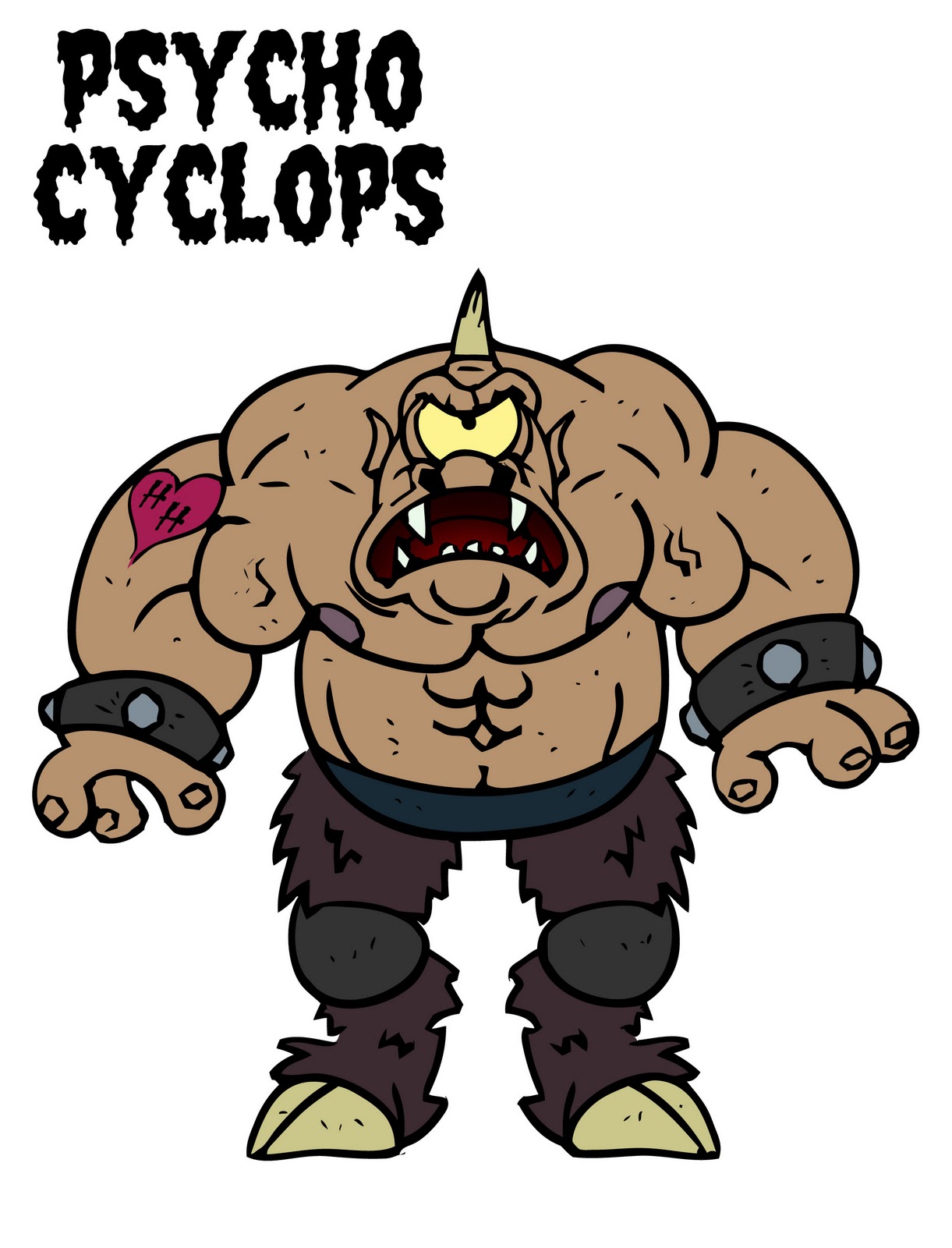
I based this design on Harryhausen's Cyclops from the movie Sinbad. Just added some stylization and some wrestling attire. Even gave him a tattoo with the initials "H H" for a not so obvious reference to Harryhausen. Maybe I should make it more obvious and change it to "R H"??


Cheers!

Wednesday, March 23, 2011

Doomsday Rumble: Monster 1


Here's the first monster design for the Nightmare Pro Wrestling DOOMSDAY RUMBLE!
What is the Doomsday Rumble? It's the NPW version of the Royal Rumble. Here's a link if you don't know what that is: Royal Rumble.  

Meet: LORD SWAMPGUT, KING OF THE SWAMPS!
This guy was inspired by Eric Orchard. He creates awesome monster designs and some of those monsters have these really cool looking, humpy backs. I'd describe his work as very atmospheric and magical, with some spookiness thrown in for good measure. You can check out his work at his site: http://ericorchard.blogspot.com.

Stay tuned for more Doomsday Rumble monster designs!

Friday, March 18, 2011

Updated size chart


Here's an updated sized chart that's helped me a lot when drawing NPW characters who are next to or fighting each other. Devastator Dragon is still the tallest, and always will be...for now ;)

I went ahead and made Grave and Lobo a little taller, they were too short in the earlier size chart. Looking at it again I'm actually thinking that I might make them even a little taller. Maybe.

I've been starting some designs for the monsters that are going to be part of the Doomsday Rumble (think Royal Rumble but with monsters). I'm planning on having thirty.....THIRTY, monsters compete in that event. I'll be posting up the first few I have designed soon.

Later.

Thursday, March 17, 2011

Mr. Hyde redesign!


When I first started designing Mr. Hyde, I never would have thought that he would become one of my favorite characters to draw. Especially drawing expressions on his face, those are always a blast.

I had always aimed to design him as a big, really ugly, Muppet. I feel like the newer design is just a better representation of that. My friend Ron Scott (of The Strange Kids Club), always pointed out how ugly and gross his nose was--so in the newer design I made sure to not only make it bigger and uglier, but give it a different color, so it draws your attention.

Like the rest of the redesigns for Nightmare Pro Wrestling, his new color scheme is a lot cooler (cooler as in the opposite of warm shades, but you could say the new scheme is more awesome as well) than the original. This really adds to the atmosphere of the book that I had originally intended, but at the time I was unsure of how to accomplish it.

I'll be posting up some more soon!

Cheers!

Wednesday, March 16, 2011

Victor Monstor redesign!


I've been drawing a lot of The Horde in the last few pages of the Nightmare Pro Wrestling web comic and thought I would go ahead and post up the more recent model sheets I've done of the characters along with the original ones I did two years ago.

First up is Victor Monstor. I've been studying a lot of old Disney and Warner brothers cartoons, for my Dr. Pyewacket and Vladdy comic, and I've noticed that some of that style is creeping into my NPW pages, which I really like.  

The newer style is just so much more fun and expressive. Even the colors feel more cohesive than the old ones. However, I think the old Victor Monstor pose is hilarious and just might use it when I design the new roster images. Still no new design for Lil Fraken. I gotta get to that.


Cheers!

Tuesday, March 15, 2011

Adventures at STAPLE!

So my wife (Nicole), my brother, my two sisters, and myself went to Staple, the independent media expo, this past weekend.  It was exciting to see what other artists are doing and chat with them about their work.


The first artist who really caught my eye was a fellow named David DeGrand. He had a lot of great looking prints and a cool comic called "Heeby Jeeby Comix." The comic was an anthology of comics done by David and fellow artists Chris Houghton, Bob Flynn, and Dan Moynihan. The stories included great character designs, monsters, and fun situations. I picked up the comic and thinking about it now, I'm wishing I had picked up one of his prints. David was a cool guy and he even did a quick sketch for me on the end page of the comic. You can check out more of his work over at his site: http://degrandland.com

 We also ran into a friend of Nicole's named Ximena who had a table with a couple of friends. They had some great stuff and my eyes quickly moved to a mini comic they had called "Cobra Commander Comics" and I was sold on the cover alone. Even just flipping through it I knew it was Awesomely hilarious! It was about Bill a beaver, Eric a superhero(?)looking guy, and their new roommate Cobra Commander. GREAT STUFF! Best $1 ever spent and we also had to get a cute pin that Ximena had designed. You can check out their website at: http://mascotwedding.com


Moving down the aisle, we came across Chet Phillips's table and wow! Nicole and I were in awe. He had a bunch of fun stuff. We picked up a trading card set called "World War Monkey" a Portrait of Military Monkeys.  Which was just that, Portraits of Monkeys in military uniforms. We also came across a handbound book, bound by his wife, called "Wrestle Pets." Of course I HAD to get that one. Inside the book had fun drawings of cats and dogs in Lucha Libre outfits along with fun wrestling stats. Chet was really cool and you can check out more of his Amazing work at his site: http://chetart.com


We all left feeling inspired and extremely happy with our experience at Staple. Hopefully me and Nicole will be putting in an appearance of our own at a table there next year.

Later.